Nanda@nandafyi
Engineer at Vercel, writes about computers and stuff @nan.fyi
I’d say I do two things: (1) I make websites; and (2) I write about complex topics in computer science and web dev. These two things tend to overlap, which leads to projects like Not a Number and Interactive SVG Animations.
What led you into design and code?
Growing up, I’ve always been surrounded by people who love design.
My mom is an architect; I learned to draw from copying her work and she would often take me to shops to buy materials and paints. My dad is a photographer; he taught me the basics of composition and lighting, and would later teach me graphic design as well.

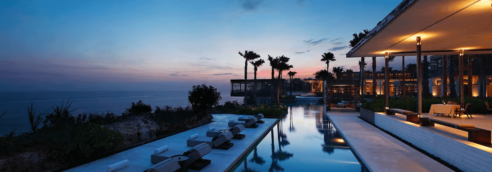
Alila Uluwatu, a resort in Bali that my mom helped design.
Funny enough, what accelerated my passion for design was Minecraft. I spent most of my teenage years making guides for “how to build well” in Minecraft. These guides went semi-viral—I think they’re still in a Minecraft forum somewhere.
My coding journey isn’t as interesting—I didn’t know what to major in, so I decided to do business and computer science since it seemed useful. Ended up falling in love with coding.
Can you tell us about your work at Vercel?
I spend most of my time as a software engineer in the internal tools team—I do everything from talking to internal stakeholders and project planning to designing UIs and implementing APIs. Recently though I’ve been helping out with UI work for some upcoming products as well as doing some design system stuff with Emil (among others!)
As an engineer, how did you get better at design?
It was actually the opposite for me—I started off with design and got into engineering later. So I guess in my case, I’d say it came naturally.
If you are an engineer looking to get better at design though, I’d say this: develop taste. Immerse yourself in things that people say are “good design” and then dissect why that might be the case.
Pay close attention to details. Take this interaction from Family for example — why does it feel so good?
Alternatively, read Refactoring UI 😄 (but still surround yourself with design!)
Bookstores, furniture stores, pretty buildings, and of course, Twitter.
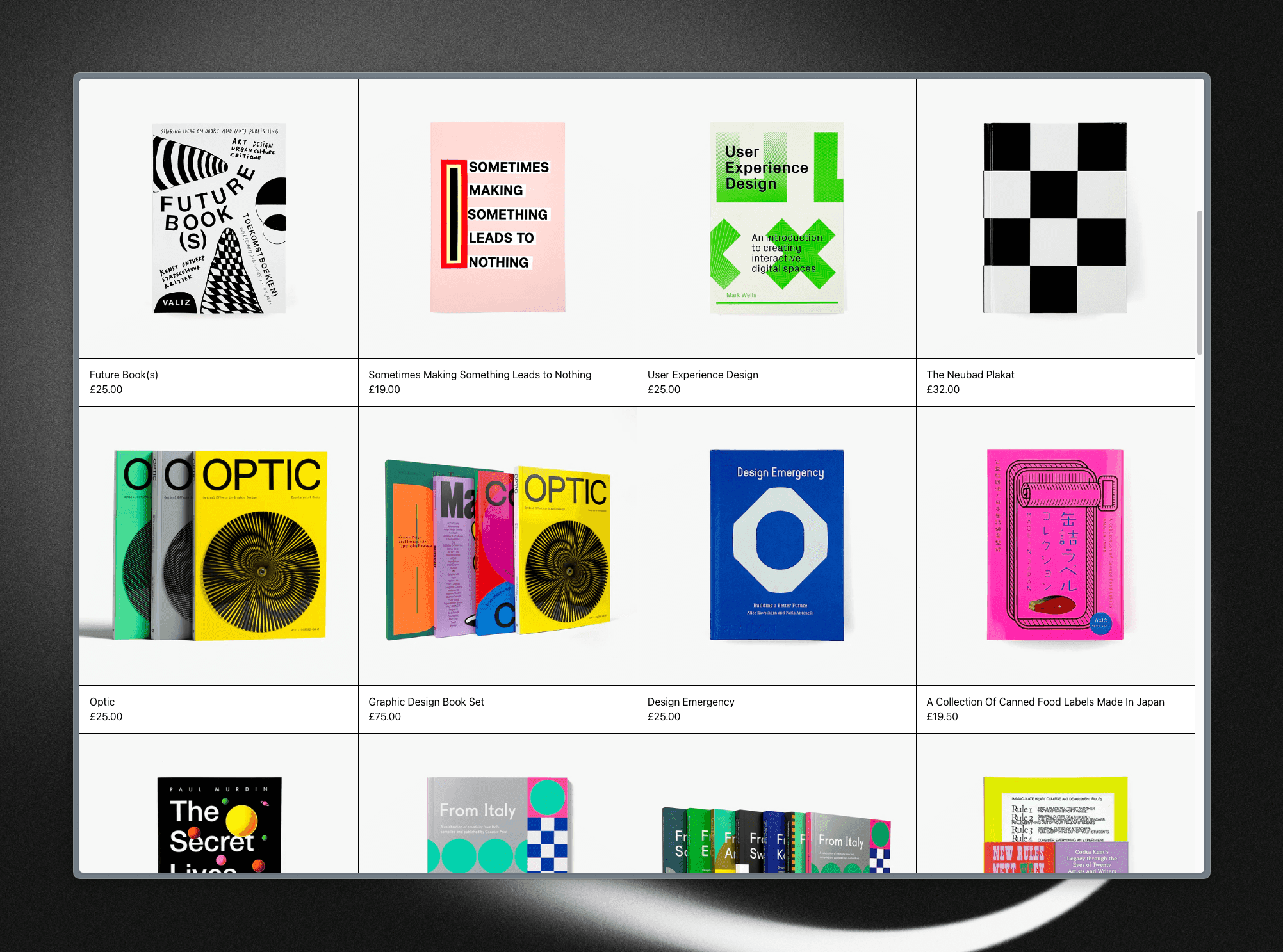
I’ve been really into editorial design recently though. I bought Stripe’s Increment bundle solely because of how pretty they looked, and Twitter’s been feeding me books from Counter-Print, and I love how each of them looks:

Screenshot of Counter Print's website
How do you keep yourself motivated?
I spend a lot of time not working.
After going through a phase of really bad burnout, I realized how important it was to make sure you actually want to do the things that you do. So whenever I don’t feel like working, I just — don’t. This is only for side projects of course, not saying you should skip on your main job!
It’s really easy to fall into the pit of just not working though. So I try to timeblock about an hour a day each night for working on side projects. If I don’t get in the flow in that time, I try again the day after.
What are your design pet-peeves?
Feels a bit weird saying this considering I’m making an animations course, but too many animations. Rauno worded it best in his essay on Interaction Design:
A good example for this would be command menus. It's tempting to throw an opacity and scale fade on the overlay. But if we for a moment consider the interaction frequency being hundreds of times a day, it does start to feel more like cognitive burden after seeing the same animation for the hundredth time.
I think animations should be deliberate and communicate a purpose, but ultimately shouldn’t impede on user experience. Of course this is really hard in practice, and I’m guilty of over-animating myself. I’ve only seen two companies do this really well—Apple and Family.
What are you currently excited about?
My course, Interactive SVG Animations! I’m building the course platform from scratch, and I’ve been thinking deeply about what a learning experience fine tuned for learning SVGs might look like. It’s going a little more slowly than I’d like, but I’m excited for the final result!
More generally though, I’m really excited about the web as an education medium. The web was initially built as a document store, so most education materials today follow the same static structure—a collection of videos or a collection of articles.
Today, the web is dynamic, interactive, and collaborative—so why do most educational content still focus on static content? Tools like Sandpack and folks like Josh Comeau are pioneering in this front, and I’m really excited to see how this might change in the future.
Do you have any advice for ambitious designers or engineers?
I’ve mentioned already on what I’d say to engineers, but for designers: look for inspiration outside of the web. When taking inspiration from web design, it’s really easy to just follow trends—making your website or app not stand out, blending into the crowd.
Pick up an architecture book. Take a look at some photographs. Save that poster that you like. Visit a high end fashion brand just to look at the details. I’ve personally gotten a lot of inspiration this way.
How does your setup look like?
It’s nothing special at the moment; I’m in the process of reworking it. I have an ultrawide gaming monitor connected to my PC and my Macbook, along with two mice because I have yet to buy a KVM switch.
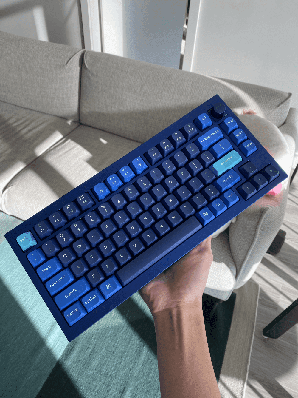
I’m in love with this Keychron Q1 that I got recently though:

I’ve been really into fashion brands recently: Issey Miyake, Bottega Veneta, Maison Kitsune, APC, among others.
Key Takeaways
Immerse yourself in things that people say are “good design” and then dissect why that might be the case.
Animations should be deliberate and communicate a purpose, but ultimately shouldn’t impede on user experience.
When taking inspiration from web design, it’s really easy to just follow trends—making your website or app not stand out, blending into the crowd.